TL;DR: I struggled for years with working out how to capture ideas for articles and socials. I had huge Notion systems, with Zapier and Make playing a serious part in my content capture. I created elaborate Tally forms to add ideas from anywhere and everywhere. I dabbled in all the different capture methods that I could think of. Not only thinking outside the box, but throwing the box away! My content creation game was on point!
Some were more successful than others.
Let’s go through everywhere I’ve been and where I am now!
What is Content Capture
In its purest form, content capture is the process of seeing something posted in your orbit or online that you want to write about, make a video on, share with your followers on socials, and writing that shit down.
That’s it.
Having an idea, taking a picture, or grabbing a link and recording it somewhere to work on later. That’s the capture process.
In this article, we’re not looking at the next two phases of creating content, or archiving content, just how I capture things that spark my curiosity.
Why is it such a problem?
When you have a whole convoluted process mapped out, it’s more restrictive than helpful. You have to work out where something should go, to capture it. It’s a nightmare.
If you have to work out where something should go, you’re adding friction. You should be able to just drop it in, and move on.
By creating a complex saving system, you’re giving yourself reasons not to save something.
Each person has their own capture process, and a quick search of YouTube will result in hundreds of people touting that theirs is the best one out there. I’m not saying they’re wrong, they’re probably right for people like them. But what I am saying is capture processes are like dating, play the field before you settle on one, and don’t be afraid to get a little freaky and get something that truly works for you!
You also need to remember that your capture process will need to evolve as your style changes. What works now, might not work in six months, or six weeks come to that! Don’t be scared to change it when you need to.
Did you know I have a newsletter?
You might like it!
You can unsubscribe at any time.
Elaborate Notion Workflows
Notion is wonderful, I love it, but I tend to complicate it.
For clients, I create perfect systems, and craft flawless digital homes, with the path of least resistance. Beautiful dashboards that tell you exactly what you need, when you need it.
My own Notion looks like a car crash, I experiment often, I tear it down and start again. When I need to work out a process, I create a brand new space to do it. This is great for clients because I’ve already made mistakes in my own space and know the best ways to do things in theirs. But it means that my personal Notion is a bit all over the place!
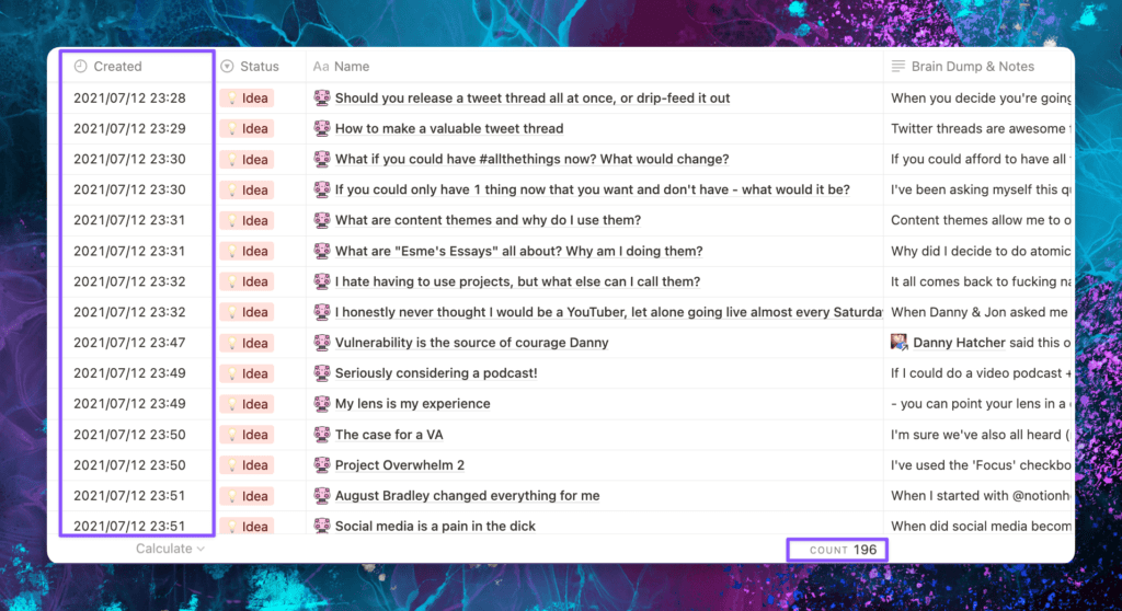
Here’s one of my first article databases from 2021, showing 196 unused ideas. Yeah, that’s a thing!
I have created countless Notion workflows for content capture and idea dumps as they come up, but my biggest issue with Notion is that if you write anything in the body of the page, you can’t then add a template over the top. So if I decided that an idea was going to be an article, write out everything for it, then decide it’s going to be a YouTube video (when I was regularly on YT), it was a pain in the ass to change it around!
As is the story of my life, all I did was create pretty friction.
Just because I don’t use Notion for capture doesn’t mean I don’t use it for tracking & archiving. Stand by for that article!
Craft Docs
Oh my word, Craft Docs are gorgeous. And they really are. The care and attention they’ve paid to the experience of writing is just stunning. I used it for a few months, paid for Pro for a year, but it never quite hit the mark for me.
The writing experience was out of this world, but the organization never quite gelled with me for content creation.
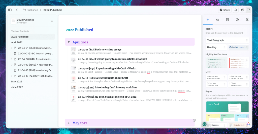
It has improved a lot over the last couple of years, and it looks to be a little more intuitive, but this, once again, turned into pretty friction.
I dabbled in Drafts
But it doesn’t handle screenshots, so that was out within the first few hours. I thought it might be the answer because you can automate notes going to all different places, but a lot of my ideas are sparked by something that I see, and I love to grab a screenshot as well as note down my thoughts in the moment so that when I come to write an article about it, or share it on socials, I remember the source as well as my instant reaction to it. The initial reaction I have to something might change, when I’ve slept on it, but I need to have the screenshot, associated capture information, and the initial notes to be able to create anything around it.
Because of this, Drafts just didn’t do what I needed it to.
Tally Forms work surprisingly well for Content Capture
I’ll come right out and say it, I love a Tally form! Any excuse to create a form, I’ll take it! Tally has all the features you need, for free. Yup, free!
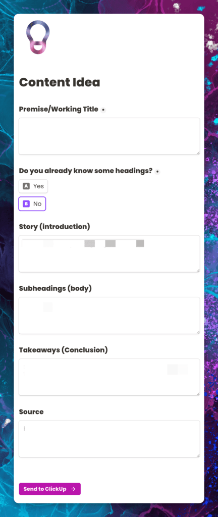
So it was a great use case for me to create a form where I could pop article ideas down, with headings and thoughts and all things like that, without losing my flow of what I was doing when the idea came to me.
I love having a form for quick entry, but there are conditions! You have to make sure that the entry into the form is as quick and frictionless as possible. You need to spend some time setting the form (and any automations you need) up before you start. This does take a bit of time but it might be well worth it for you. There is also the added benefit of being able to have a link to the form on your phone home screen, so you can just tap a button, fill out the form and then move on.
I love conditional logic (still free) in Tally. If I don’t know what I want my headings to be, I can jot down my thoughts as I have them. But if I do know the headings I want to have, I can pick “yes” and a whole bunch of new fields will show up.
The issue that I came up against, and why I don’t use this anymore no matter how much I loved it, is simple. I was feeding my Tally form into ClickUp, but if I put an attachment field in Tally, the screenshot won’t import into ClickUp, it’s not something that can be done.
Which leads us into…
ClickUp and ClickUp Forms
Like many people, when ClickUp announced conditional logic in Forms at LevelUp in February 2023, I was excited. I love Tally, I use it for a lot of things and I keep finding great use cases for it. But, if ClickUp forms were getting conditional logic, I might not need to have an external form platform. Alas, conditional logic in ClickUp forms was released to Business Plus customers and above. I love me some conditional logic, but I’m not going to pay more for ClickUp to get them, when I get them for free in Tally.
That’s just me! If you want everything in a single place, then it might be worth upgrading for that function. However, my use case? Not so much.
Obsidian is lovely, if you want a mind garden
I don’t, so it’s not overly useful for me. I did pay for Obsidian Sync for a few months, but again, it takes a while to set it up so that it’s usable, and then you have to factor in the ways that you can get your information out as well. Don’t get me wrong, I love Obsidian, but I could never get it just right.
I’m assuming I’m not alone in this, and I would assume it’s like Notion and ClickUp in that regard; you have to spend some time getting the system (back-end) set up just so, so that you save time when you save thoughts.
I managed to create some pretty awesome automations inside Obsidian to add specific text to a page, and that was a bit fab, but it can get a bit technical, and on mobile, it’s not so great. All your notes are Markdown files, which is awesome because they’re teeny tiny, but you still have to host (save) them somewhere. iCloud is your best bet, but make sure it’s right for you.
I’m also not a huge fan of having to have a separate folder or space in Obsidian just for images, that doesn’t make sense to me, but I’m not a developer, and I’m sure it does actually make sense. I just want to take my screenshot, paste it somewhere with a few notes, and move on.
Don’t get me wrong, I love the idea of cross-linking notes, especially for content creation, but I never seem to get much use out of it. I know that I could make links and synthesize information from different sources, but having been in academia as a student for over 20 years, I’m tired of that. But I want to write about what excites me, fires me up, and gets my juices flowing. I don’t want to make links or obscure connections that no one else ever has in the space I write in. Personally, it’s tiresome. I’ll leave the groundbreaking findings and serendipitous links to other people.
Everything hinges on CleanShotX
I take a ridiculous number of screenshots on my Mac, anywhere from 500 to 1000 a month. I live on my Mac, my iPhone battery lasts a week because I’m always on my Mac. CleanShotX is my go-to screenshot app. It has completely replaced the native Apple screenshot tool, and the upgrades they came out with recently (September 2023) are utterly wonderful.

I will say, the image shows around 200 screenshots, these are the ones that I’ve saved but haven’t cataloged, or need to save for something else. When I take a screenshot of something that I want to capture in my super simple system, I paste it in, then delete it.
My Current, Simple, Content Capture Process
Sometimes, you just need to go back to basics.
I’m an Apple user, I have a MacBook Pro, iPhone, iPad and Apple Watch. The only way I wouldn’t be an Apple user at this point, is if Apple went bust.
Apple doesn’t have a database application. They have Pages, Keynote and Numbers, Notes, Reminders, iMessage, Safari, but no database. Even Microsoft Access doesn’t work on Mac. You’ll note that Notes (no pun intended) is in bold.
For me, personally, Apple Notes is perfect. I can dictate, add images, add links, add my initial thoughts, from my iPhone, Mac, iPad, anywhere I like. I even have a button on my Stream Deck to create a new note. I’ve added hot corners to my Mac as well, so I can move my cursor to any corner and a little note will peek out, I just click on it and it’ll create a new note under the “Quick Notes” section.
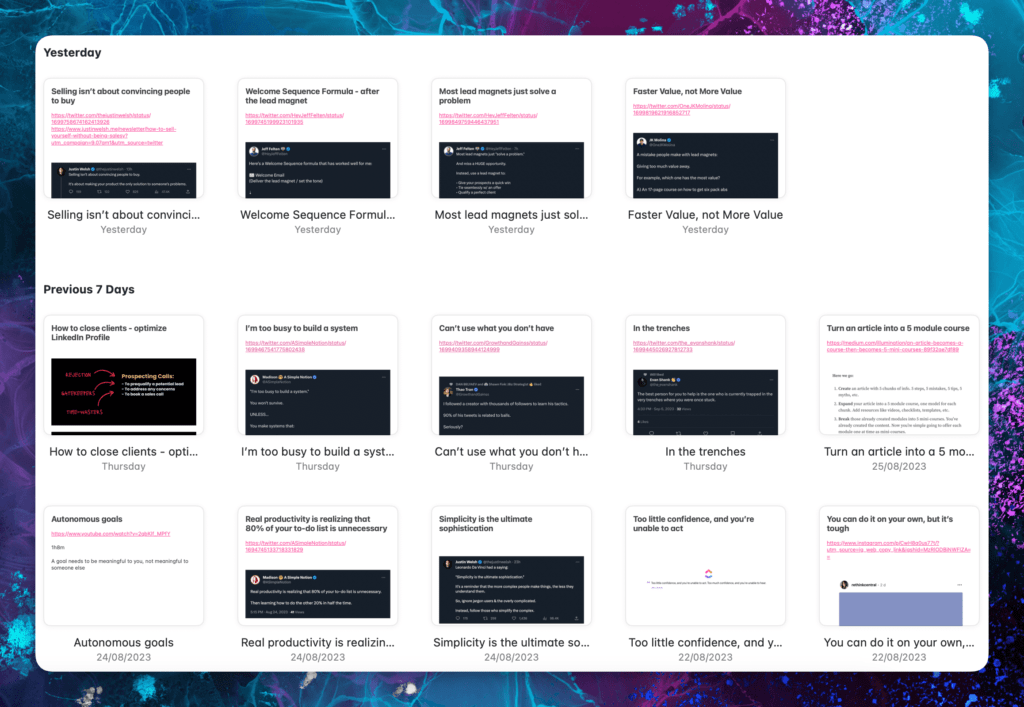
Because this is Apple, it’ll sync across everything, pretty instantly.
It still has the drawback of many capture vehicles, in that it doesn’t work offline. But, whereas most you can’t even open, with Apple Notes you can create notes that will sync when you have connectivity again. There is also the option to have an “On My Mac” folder if offline is something you need regularly. I don’t. So I don’t have it turned on, but it’s nice to know it’s there.
So that’s it, nothing magic. My stupidly simple content capture process
Yes, this is a list of 13 things, which, I’ll be honest, take around 30 seconds to a minute to do.
- Read stuff online
- Find something that resonates and I want to remember for later
- Take a screenshot (CleanShotX)
- Move my cursor to the bottom right-hand side of my screen
- Click to create a new Quick Note
- Give it a title and press enter a few times
- Paste in the screenshot
- Move the cursor up a couple of lines
- Grab the URL of the post & paste it into the note
- Move the cursor up another line or two
- Write down what I think or feel about it
- Close the note
- Delete the screenshot
- Move on with whatever I was doing.
On mobile, it’s pretty similar, either I take a screenshot and save that using the Quick Note function (dragging down from the top right of my iPhone), or use the Share Sheet to share a tweet or LinkedIn post to save the post directly to my Quick Notes.
So, that’s everywhere I’ve been, to try and make the fastest content capture possible. And the stupidly simple routine that I have now. This is part one of my content creation system.
Connect with me on X and let me know how you capture content ideas!
Want to read the next part of this series? I got you!

 esmecrutchley.com

![Using [Ad] or #Ad everywhere - don't say I didn't warn you](https://esmecrutchley.com/wp-content/uploads/2023/07/23.07.17-If-youre-getting-paid-in-any-way.jpg)
