In my experience, having a separate app or space or something to jot down content ideas to get them out of your head is better than opening your ‘writing’ app and getting them out of your head there.
Of course, you can open Notion, ClickUp, or any other places you have to write the bloody thing, but if you want an actual quick add for content ideas, you don’t want to open any app or program where work actually happens.
You need total focus.
You need a blank slate to jot down your content idea.
Now, having a blank slate is different from having a blank page with the dreaded blinking cursor, which causes you to clam up the minute you open it. We’re talking about being strategic here, people!
Here’s the thing, Content idea capture in your note or productivity app should be quick, but 9 times out of 10, it’s not. You have to set up lists, views, dashboards, and fuck only knows what else just to get this shit out of your head and into a usable format. Not only that, but you likely have to set it up twice; one might look great on a desktop but shit on a mobile, adding to the work you have to do before you can capture anything!
Did you know I have a newsletter?
You might like it!
You can unsubscribe at any time.
Get it out of your head.
We (at least I) want a structure to get shit out of my head in the fastest way possible, in a way that makes sense, without worrying about where it will land or any formatting bollocks. I don’t need to worry about things that will only happen in the future. I just want to get shit on a page.
I avoid opening something where I will likely have notifications that need my attention or a place that shows me online (think ClickUp & Notion). I need a 100% separate space where I can focus on getting what’s in my head, out of my head, in a way that makes sense in 3 days, 3 weeks, or 3 months when I come back to it.
If this sounds like you too, my friend, you need a content form!
Pick the right form app for you.
Picking the right form app is super personal and largely depends on your use case, what you need it to do, where you want submissions to end up, and your budget.
Some allow you to connect Stripe to collect payments and charge varying percentages on top of the Stripe fees.
Some are the best for Notion.
Some have a specific number of monthly submissions or limit you to the number of forms you can have ‘live’ at once.
Don’t use Google Forms.
There’s Google Forms for, well, I don’t really know when you’d use a Google Form. Personally, and this is just a personal opinion, if you provide me with a Google Form, I am NOT filling that shit out, I don’t care what it’s for. There are so many other free programs out there that I really don’t understand why people don’t put in the extra effort to NOT have a Google Form. I get it; they’re free and integrate directly with Google Sheets. Tally’s free and does the same thing.
Additional Considerations
If you need HIPPA compliance, there’s not much to choose from, and Jotform normally wins by a mile (it is a paid feature, though). Jotform also has a vast array of integrations, which is great when you need submissions to go through a pipeline or end up in multiple inboxes.
For this workflow, I don’t need any of that.
This is an internal form, meaning I’m the only one who knows it’s there! I’m the only one with the URL, and it’s there for me to be able to do my thing, not for anyone else to fill out.
Why ClickUp forms aren’t the forms for me.
I, like 3,800 others, voted in Canny for ClickUp forms to have conditional logic. Like probably 50% of that number, I was utterly miffed when conditional logic in forms was released to Business Plus and Enterprise accounts only.
Here’s the thing, ClickUp forms are great in their way, but when you actually compare them to proper form platforms, they fall a bit flat.
Limitations with ClickUp Forms: Existing Fields
ClickUp forms will only draw from existing fields in the list they’re attached to. Yes, you can add custom fields as you build the form, but that’s all the creative flare you have. On the Business Plan, you can change the icon at the top, and you can remove the ClickUp branding as well. But you can’t add headings, flavor text, images, or anything else that might make your form a bit nicer to look at and more engaging for the filler-inner to fill in.
Limitations with ClickUp Forms: Branding
Forget styling, forget getting creative with brand fonts, forget putting a gif on the form page (although it should be pointed out that you can on the thank you page if you know how), forget being able to use a color picker. You have the standard ClickUp fonts and colors, and that’s pretty much it.
Yes, you can add flavor text as placeholder text, and that’s about your lot, I’m afraid. You can’t add a bit of a description to the questions to add context or suggest things the form filler-inner might like to include in their answer (unless you put it in the placeholder text). They’re limited and still are limited (depending on your use case) in 3.0.
Limitations with ClickUp Forms: Distribution
Also, ClickUp forms only link to one list, meaning if you want something to end up in multiple places, you’ll need some kind of automation, regardless of whether you want it in multiple lists or another place outside ClickUp, after the form submission.
I will point out, though, that we have a straightforward form in the Agency for people to let us know when they’re not going to be around, holidays, vacations, cat’s wedding, that sort of thing. And that form works perfectly. Because we’re not trying to get too fancy with it.
We’re asking them to let us know a title, e.g., “Esme’s off for the King’s Coronation,” then they can pick their name (everyone is in this list), then choose the start date and end date (even if it’s only 1 day they have to fill in both otherwise the automation doesn’t work), and then there’s a section for any more details they want to give. For this, it’s absolutely, 100% the best option.
For my content workflow, though, not so much.
Disclaimer – for this process, you’re gonna need Tally (free), ClickUp (unlimited – the free plan doesn’t work because of the number of custom fields), Make or Zapier (single trigger & action needed to get the job done, unless you wanna get fancy!).
So, what do I use for content ideas?
Tally all the way for me!
I’ve been using Tally since Notion got an API, so a fair while! Initially, I used it to get appointments and things like that, into my Notion workspace that I knew I would forget otherwise. But then it grew into a behemoth of different forms for people to request videos (when I was on YouTube), give me feedback, or anything you can think of, I had a Tally form for it. I had Tally forms linked to Notion databases up the wazoo in 2021.
Nowadays, my ideas need to start in ClickUp; that’s where I triage them and work out if they have legs or are just utter bollocks that no one would read if I wrote them. Therefore, I need a form that can talk to ClickUp. I played with ClickUp forms, and as you might have guessed if you’ve read this far down, not a fan! Again, for simple forms for simple lists, they’re perfect.
Everything works because there’s no intermediary, you pick form fields based on the properties and custom fields you already have in the list, or add more if you need to. Everything in ClickUp forms is a 1:1 relation, with the added benefit of being able to add a template on a form submission, which is rather neat.
But, I wanted a single form that went to my Ideas list in ClickUp but that I could pick fields to show, based on which part of my framework I was using.
The PSST Framework for Content Ideas
Let’s talk quickly about my framework for a second. I read this fantastic article in 2022 about the PSST framework, if you’ve not heard of it, head here to check it out, it’s kinda mind-blowing.
When writing down a Content idea, you want to make the initial entry as full as possible so that when you come back to it, you have some idea of what the hell you were thinking. Just a title isn’t going to cut it here, people.
You want extra info, you want context, you want a map of exactly what your brain was thinking when you came up with the idea. You will not remember that in 3 months, believe me.
Let’s Break Down the PSST Framework
So the Premise is the working title, followed by the Story; what will frame this article, what’s the lens, and who are you writing to (this is a much better way of framing thinking about an introduction)?
This is followed by the Subheadings; now, these don’t have to be fully fleshed out at this point; they just have to be the things that you might want to cover when you come back to it.
Even if you don’t use any of them, they will give you an insight into what the hell you were thinking when you wrote this down. And the last piece is the Takeaways, what do you want to reader to walk away knowing, what do you want them to feel, what do you want them to do (again, thinking about it like this, rather than thinking in the restrictive term of “Conclusion” really helps to pull everything together)?
Tell Them What You’re Going To Tell Them
In marketing, or sales speak, this equates to (1) Tell them what you’re going to tell them (story), (2) Tell them (subheadings), (3) Tell them what you told them (takeaways), and I find that using these two frameworks together makes my conclusions actually match the bloody story!
It also makes writing much easier because I might know the takeaway I want people to have when I first have the idea. Some people think this way of writing content is outdated, and they may be right, but hey, if it works for your brain, implement it!
You need to pick the bits that work and ignore the bits that don’t! I use both of these frameworks to get things out of my head, but I may not strictly stick to them as I’m actually writing the piece, but they’re helpful for getting shit out of my head.
Right, after that slight diversion, back to forms, specifically, Tally.
So, I have this fantastic form, but all it shows me when I open it is a long text box for the Premise and a question with two answers “Do I already know some headings” [yes] or [no]. This is because I have conditional logic set up on the form depending on what I pick.
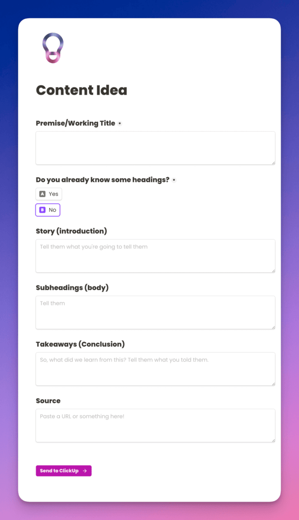
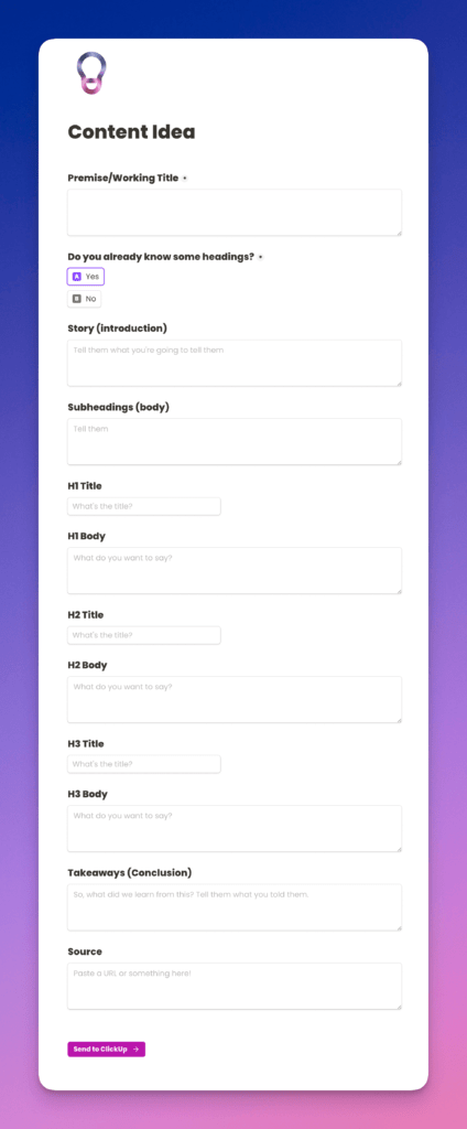
If I say no, I will get the Story, Subheadings, Takeaways, and a Resource long text boxes pop up. If I say yes, I will get all those, but I will also get H1 Title, H1 Body, H2 Title, H2 Body, H3 Title, and H3 body short and long text properties.
Because this is in one form, I can pick [no], get halfway through writing it, and switch to [yes], and I’ll also get the rest of them there. Because, come on, sometimes it starts off as a [no], and then I get writing, and it’s pretty apparent it needs to change to [yes]!
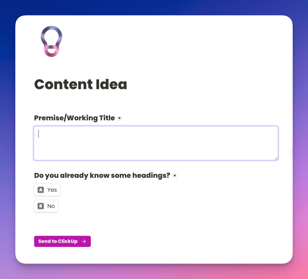
This is the way that the base page is presented to me when I first open the form, and this is what it reverts to when I click “Send to ClickUp”
That’s great, but where do the submissions go?
I’m so glad you asked!
Now, if you want to, you can feed Tally form submissions into a Google Sheet. Be warned, though, don’t waste time setting up a gorgeously spaced, formatted, and colored Google Sheet beforehand. Tally will create this for you as soon as you grant it access to your Google Account, meaning you’ll have to delete the perfectly curated and colored original so you don’t get confused!
Using Make or Zapier to get Submissions into ClickUp
As is pretty evident by now, I want mine to ping straight into ClickUp, and for that to happen, we either need Make or Zapier because Tally doesn’t have a native ClickUp integration like it does with Notion (a girl can dream). I have tested this out with both, and they do exactly the same as the other, so it’s totally up to you which one you pick. I’m going to go through Zapier here.
So the trigger is a ‘new form submission’ on my ‘content ideas’ form. The action is to create a new task in my ‘Ideas’ list in ClickUp. In the Zap or Scenario, you want to make sure that you’ve mapped your form submission fields into the right properties and custom fields in ClickUp. And that’s it. Every time you fill out the form, it’ll add it to ClickUp. Word to the wise here, don’t be tempted to add yourself as an assignee in the Zap or Scenario, otherwise, you’ll get a ping each time you have an idea, as well as a bloody notification!
For preference, I have a list just for ideas. The reason for this is that I don’t know if the idea that I have will turn out to be an article or something that I want to put in my newsletter (both of which have their own separate lists), and I do not want to have to make that decision when I’m getting an idea down.
Removing the need to decide if this is going to be one or the other (or just downright abandoned) means that it’s best to have a single list just for ideas so that I don’t get stuck not writing the bloody thing down because I don’t know where it’s going to end up!
Limitation to this workflow: Image Properties
Being 100% transparent, there’s only one thing that I want to be able to do that I can’t, and that’s to add images to a form field in Tally and use Zapier or Make to get these into ClickUp. Neither Zapier nor Make support this custom field type on ClickUp’s end.
Why is this important? Say I’m doom scrolling through Twitter, and something catches my eye, and I take a screenshot. I would love to upload that screenshot on my phone into a files property in Tally and for that to sync into ClickUp. Yes, I have a ‘resources’ long text field where I sometimes remember to put the URL of the tweet rather than a screenshot, but it would be great to have the option of either.
There is a workaround if you’re game, but this would involve a multi-step Zap, and that’s not within everyone’s budget! The extra step would be adding a reminder to something like Todoist, where you could link to the ClickUp task to remind yourself to upload the photo in ClickUp “tomorrow.” It’s a hacky workaround, but it works if you need it!
Tally set-up hacks
This was obvious to me, but everyone I’ve mentioned it to didn’t know, so I’m going to say it here: set your ‘redirect on submission’ to the URL of the form. You can find this under the form Settings by turning on the switch for ‘redirect on completion.’ You can find your form URL under the Share tab in Settings. That means when I’ve submitted a Content idea, I’m taken right back to the same page to do another one. I have 100% removed the ‘thank you’ page because this is an internal form just for me (I don’t give out the URL to anyone else). So when I click ‘Send to ClickUp,’ it’ll redirect me to the same page, saving a click, and putting me right back where I need to be to add another one!
Don’t Forget to Check Your Settings
Also, make sure to head into Settings and get it to email you submissions. That way, if everything else goes wonky, you still have the original form submission in your email, should you ever need it.
This next one is a bit iPhone/iPad-centric, but as that’s what I have, that’s what I’m going to talk about!
Set up an Apple shortcut to that URL for easy access. Head into shortcuts, create an automation into your browser of choice and put the URL in (the one from the Share tab). Change the title of the shortcut to something obvious (for me, I’ve just called it Content) and change the icon (I’ve added a lightbulb, as this is for ideas and I’m not very visually creative!), then share the shortcut and add it to your home screen. Then, whenever inspiration takes you, you can click on the lightbulb and be taken to the URL in your preferred browser.
What happens next?
Absolutely nothing.
That idea can sit in the list for as long as it needs to. Because I used the framework and got as much out of my noggin as I possibly could at the time, I know when I come back to it, I should be able to write it. It can languish in my Ideas list in a deck chair with a cocktail with a little umbrella in it on the beach for as long as is necessary!
OK, but what REALLY happens next?
I have a single ClickUp automation inside the Ideas list to move something to the correct list.
In my automation, I’m watching for the Content-Type custom field to change, meaning that this can be achieved on the Unlimited Plan (as there’s only one trigger), and then I leave myself a note to change the priority even though that’s not the trigger.

So, I tell myself I need a priority and a type, but the automation only runs on the type. I have ClickUp Business, so I can have triggers and conditions so that I can use both, but for the purposes of this, leave yourself notes of what you want to make sure is there before the automation triggers! Just tell yourself what you want to be there, based on how you view the task in the list it’s moving to.
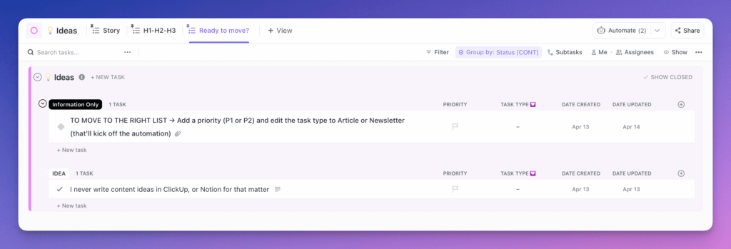
In this example, I set the priority and the Content-Type custom field, and the task will disappear from the Ideas list and pop into the Article list (or the Newsletter list) through automation.
Small point – the actual lists statuses for all my content lists are To Do and Done. Everything else is worked out in Stage [CONT].
Grouping in ClickUp
I have the Stage [Cont] custom field in my Articles list, which I group my views by. All tasks are at the ‘Ideas’ stage first, and this is something that I’ve also set in my Zap. The ideas section in the Articles list is organized by priority, so I want to set this before I set the Content-Type to trigger the automation. The priority is my confidence in writing it or how soon I want to write it. The urgent priority will appear at the top, followed by high, and so on. This means when the task pops up in the Article or Newsletter list, they’ll be organized by how soon I want to work on them.
After this happens, I only need to go into the Ideas list again once I want to review my ideas and work out what I want to work on. There are a lot more automations that happen next, but that’s for the next article!
So, what have we learned from this
Like many things, forms are personal.
You have to pick the one that works for you for the task you want to do.
This means that you can use multiple platforms. [Read that again].
They all do similar things. Some do them in different ways, some do them the same way, some might not have the integration you want, and some can be made to do what you want by using Make or Zapier. At the end of the day, it’s all about you. What do you need your form to do, where do you need it to end up, and what’s your budget? This will define what you use. If it’s something you want for internal use, like my content form, pick the platform that makes the most sense to you, and nothing is saying that you only get to choose one!

![Using [Ad] or #Ad everywhere - don't say I didn't warn you](https://esmecrutchley.com/wp-content/uploads/2023/07/23.07.17-If-youre-getting-paid-in-any-way.jpg)
