")
Hello gorgeous!
I thought this week we’d have a chat about accessibility, specifically alt text for online writing and socials, proper hashtag use, and SRT files for video uploads.
I will preface this by recognizing my privilege in that I don’t need a screen reader in order to read anything online, subtitles to watch YouTube videos, or Braile to read anything in print.
You might not need them either, but you can’t assume that people consuming your content don’t use them. Whether they use them as an aid because they need to, or use them to consume content in a way that they prefer, if you’re producing content online, you need to make it accessible to all.
If you want a full, in-depth discussion about what accessibility is, there’s a great article from Mozilla, mainly about HTML and CSS, but it also states:
“You might also think of accessibility as treating everyone the same, and giving them equal opportunities, no matter what their ability or circumstances…Accessibility is the right thing to do…The key lesson here is to think beyond your own computer and how you use the web, and start learning about how others use it — you are not your users.”
Reasons To Focus on Accessibility.
- You don’t know who is reading or watching your content and what their needs are
- Accessibility needs aren’t just based on disability. If you read the Mozilla article above, you’ll know that people with a slow internet or people viewing your content on mobile devices have different needs as well.
- In some countries, accessibility is the law. Again, you don’t know where your content is being viewed.
- Let’s be honest, it makes you look better.
Things To Be Aware Of.
- Make sure that the alt text you add accurately reflects the content of the image it’s attached to
- Don’t use alt text to keyword stuff to game the SEO. This isn’t an opportunity for you to rank better on Google. This is where you add descriptions of the images you’re uploading to help people who are using assistive technology to access your content. Your descriptions should accurately represent the image.
- You can use the image filenames to add additional alt text. The filename is in the background when you upload an image. Some platforms, like Squarespace, allow you to edit the filename after you’ve uploaded the image, while some, like ConvertKit, don’t. In that case, make sure to edit the filename before you upload the image.
- I’m also realizing that I can’t use certain punctuation and characters, simply because not all screen readers are created equal and don’t all read the same thing. A personal favorite of mine is &, but that’s not always read accurately, even when it is, it’s not read as and, sometimes, it’s read as ampersand, which isn’t anywhere near as catchy! Here’s an overview of the problem characters.
Alt Text on Images: Website & Newsletter.
I’m as guilty of this as the next person, I have loads of images on my website and in the previous newsletters that don’t have alt text. I didn’t know where to find the option, but that’s no excuse.
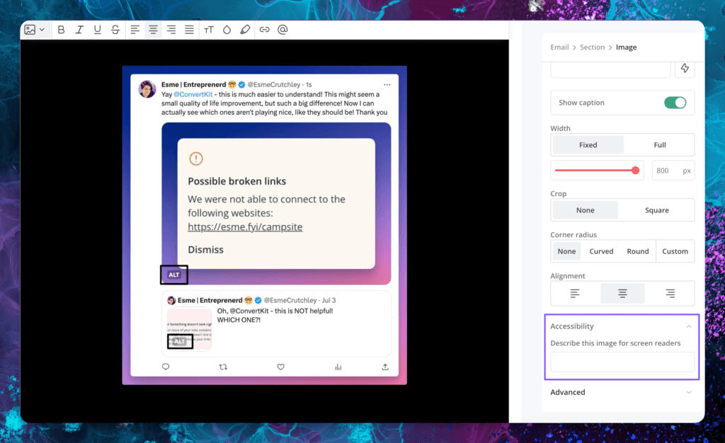
I made it my mission to find out where to add alt text in ConvertKit and on my website.
This is what it looks like in ConvertKit. Click on the image in your email newsletter, and on the right-hand side navigation, you’ll see an Accessibility dropdown where you can add a description of the image.
Accessibility Alt Text on Images: Social Media.
Most social media platforms allow you to add alt text when posting natively, and some schedulers might allow you to do this.
Remember, just because you don’t need something doesn’t mean you don’t need to add it to your socials. You are not your users, or in this case, your followers.
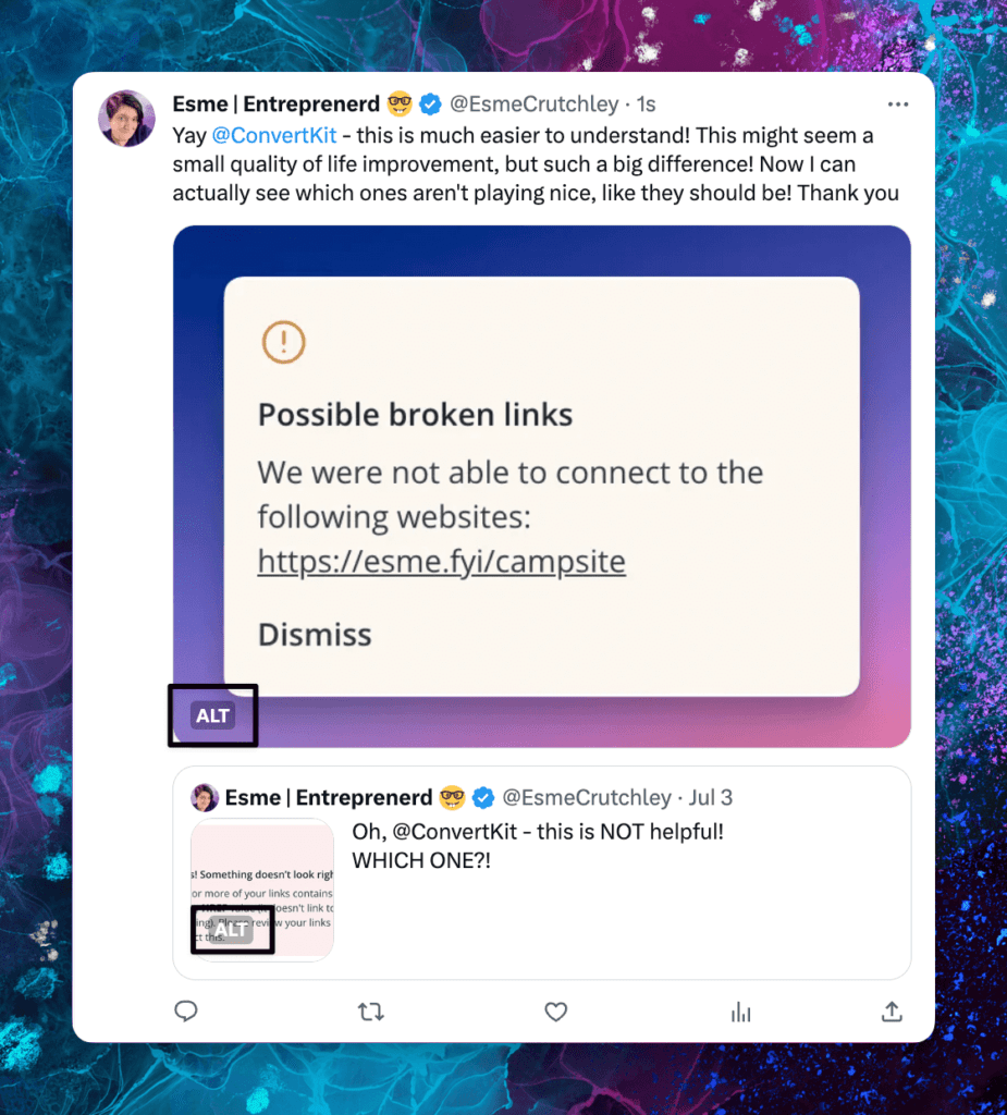
Here’s an example (from me) where I’ve used alt text both on the image and the original tweet with an image.
If you need a reminder so that you remember to do this on Twitter/X, head to:
- More,
- Settings & Support,
- Accessibility, Display, and Languages,
- Accessibility,
- Turn on the check next to Media to get a reminder to add alt text to any and all images you upload onto Twitter.
This only works when you’re in the native Twitter app, whether on your computer or phone. Any 3rd party scheduler won’t remind you to do this each time, so it’s up to you to find out how to do it for the one you use.
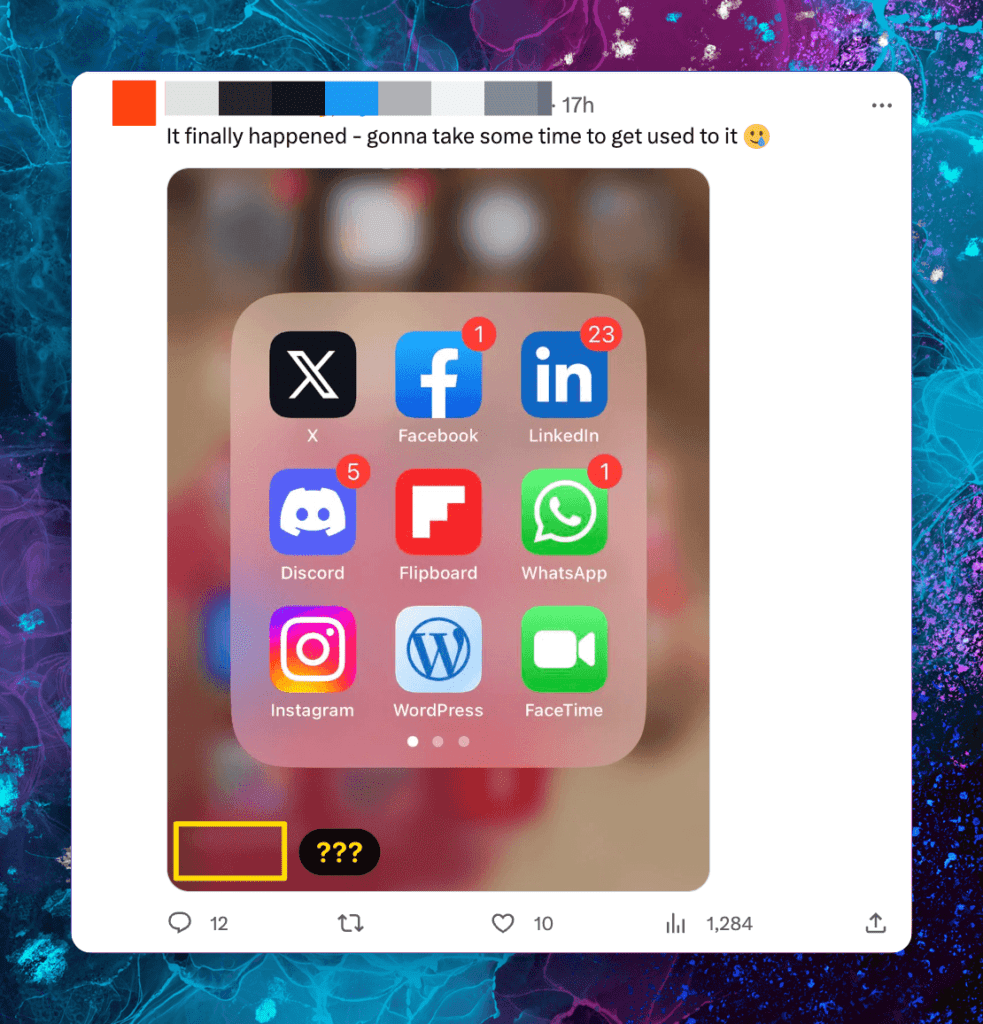
And here’s an example of an image on Twitter with no alt text. You can see that the “Alt” label is missing.
For Instagram, check out this post from Kapwing for how to add alt text natively when you post. Helpfully, when you post a carousel, you can add alt text to each image, again natively.
For help with Facebook, check out this article from Hootsuite, which goes through in detail how to add alt text in all the different places.
LinkedIn gives you 300 characters of alt text, but make sure that you’re not using this to keyword stuff, because they’ll know! Here’s LinkedIn’s help site for alt text.
Don’t Use All Caps, Anywhere.
Screen readers view and read capital letters as individual letters. They will read lol and LOL differently, simply based on their capitalization. For that word, it’s not too bad, but when you capitalize something you shouldn’t LIKE THIS, a screen reader won’t read them as whole words. It will read them as individual letters as they are capitals without spaces.
You might have noticed that my headings are lowercase now and not all in caps. This is the reason. I want to be as accessible as possible. There is a small caveat to this that I’m not sure about. When the text is presented as all caps, rather than being typed in all caps, by changing it in the font settings. I’m not sure, after all my digging, whether this type of text presents to a screen reader as all capitals (as it shows), or how it was written, in upper and lower case.
To emphasize words, it’s better to use bold, italics, another color, or all 3 if that takes your fancy! This means you’re changing how the word is presented (on the screen), not how the word is written (underneath).
Best marketing practices from 5, 10, or 20 years ago simply don’t hold in 2023.
Most of us have been told not to use bold or italics when we write copy. The problem now is that most writing happens online, and when you’re writing a blog post or newsletter like this one, and you need to draw your readers’ attention to something, you don’t have a lot of options!
I’m showing my age, but I remember when you underlined your titles or headings. Nowadays, if we see something underlined, regardless of the color, we associate it with being a link. Likewise, think about traditional physical newspapers (not the online versions) and the typography they use for headings or titles. Mostly, they’re a bold, block font in all capitals because this makes the sections super obvious, and they’re being read mostly by individuals who don’t need adaptations.
Capitalize Your Hashtags, Everywhere.
As we have established, screen readers work on capital letters and spaces, therefore when you write out your hashtags on any social platform, use capitals to separate the letters. Obviously, in hashtags we can’t use spaces because that breaks the hashtag, but we can use capitals.
What does this look like in practice?
Rather than using #sundaymotivation, use #SundayMotivation. Instead of using #businessstrategy, use #BusinessStrategy. Don’t use #throwbackthursday, use #ThrowBackThursday or #ThrowbackThursday.
What we want to do is present the words we’re using in a way that screen readers understand. To do that, we need to use spaces to separate words (exactly how we normally write) or capitals for words we’ve artificially put together, like hashtags.
One-word hashtags also need to be capitalized to separate the word from the # symbol, e.g. #Business, #Newsletter, or #Computer.
I’ll be honest I struggle with this one. And writing this newsletter to you has made me realize that all my ad hashtags in Metricool are written as #ad and not #Ad. Looks like I need to go and change all those in my scheduler!
Upload Your Own SRT File for YouTube.
I know I told you not to use capitals, and now I’m using SRT, but as you’ll know by now, screen readers read capitals as individual letters, and as SRT is a file type and it’s spoken as S R T, that’s ok.
Moving on.
An SRT file is a subtitle file that you can (and should) add to any video you post online.
YouTube can auto-caption your videos for you, but you get extra points with YouTube if you upload your own, edited and accurate versions. It looks to YouTube, and by extension, Google, that you’ve gone the extra mile to make sure that you’re uploading the corrected versions.
There are many apps that you can use to get these files from the video. For example, you can use Descript or Kapwing.
Here’s YouTube’s help page for how to upload your own SRT files to your channel.
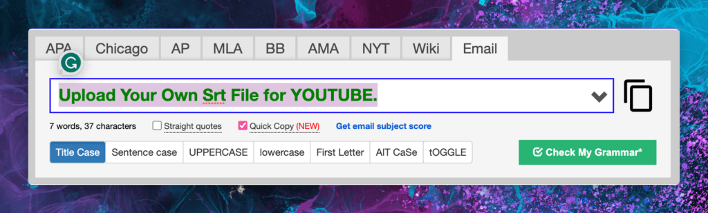
Here’s a Handy Website.
Capitalize My Title is an awesome website if you get a bit mixed up on how to, well, capitalize your titles! I use it all the time, specifically the email option, which is the orange link above.
Full capitalization for section headings covers a multitude of sins and often makes writing a blog post or newsletter much quicker and easier, but if you’re not using full caps anymore and want to make sure that the right words are capitalized, this is a great resource.
It also has a quick copy function, which means if you paste your title in, it’ll put it right and auto-copy it back, meaning that you can pop back into your post and paste it without having to do anything except copy the title the first time.
Don’t rely on it 100%, sometimes it gets it wrong, as you can see below!
Don’t Rely on Your Audience To Tell You They Have Accessibility Needs.
It’s unfair to ask your audience if they need you to adapt your posts. If they have a disability, you can’t honestly expect them to tell you on an open forum, or even in your DMs.
Let’s not do that, eh?
And we won’t even talk about the logistics, where the minute you get a new follower, you’d need to ask again!
It’s not up to them to tell you. It’s up to you to do the right thing and make all your content accessible to everyone.
Thanks for reading another email on a single subject.
It’s an important one to know about.
Don’t worry about getting it right the first time or every time.
Trying is important, too.